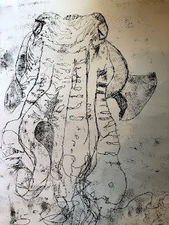
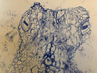
Texture and abstraction

Oil pastels and printing ink on watercolour paper
I wanted to use the paper from my failed monoprint as the starting point for this drawing as the colours and effect of the blue and green ink on the watercolour paper was texturally interesting.
I thought an orange octopus would work nicely with the blue background and used oil pastels rubbed over the textured paper, leaving a variety of marks and enough pastel in some places to then carve out additional patterns on the body.
The grainy results feels like the octopus is merged with the background, and tries to capture the sense of impermanence of its skin colour - a changeable and fantastically diverse array of colours that an octopus can change in the blin of an eye. I used white printing ink for the suckers on the tentacles and have deliberately abstracted these to make them stand out and create a more stylizised image. The end result is textured and intriguing. I feel like I am looking at a slowly decaying Greek mosaic or fabric print. I'd planned to add more detailing to the suckers once the paint dried but I wonder if that would mean it loses the impact of the simple bold circles. I also find it looks better in a slightly darker light when the colour contrasts are more apparent, so I may darken the background slightly. This is only A4 and i wonder if it would work better as a longer narrow and larger piece, or as a series of pieces, almost like panels or tiles.
Comments
Post a Comment